
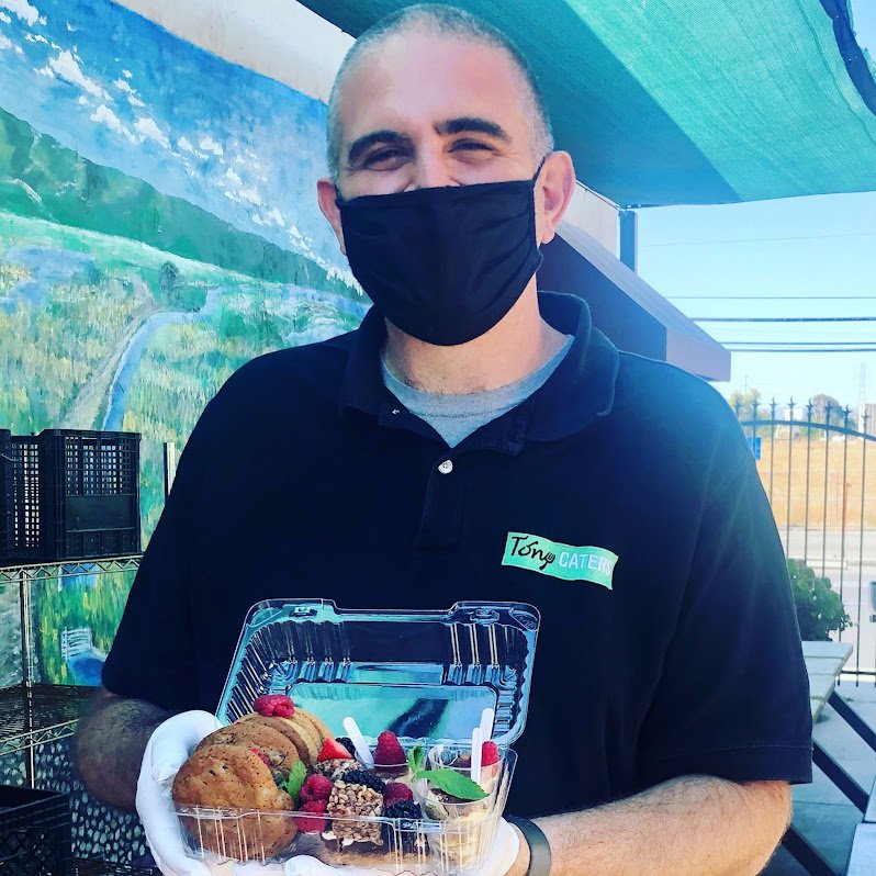
Tony’s TO GO

Tony’s To Go was a temporary meal delivery service that became the cornerstone of Tony Caters, a Bay Area catering company, during the COVID-19 pandemic. Tony’s business goals for this three-week project were two-fold: increase the amount of weekly sales from existing customers and acquire new customers.
My Role
After conducting user interviews, a plus/delta analysis of competitor websites, and information architecture and content strategy audits, I synthesized content and helped simplify the user flow for new and existing users.

A Temporary Solution
As the state of California opened up in June of 2021, soon after our team delivered our proposed design solution, the team at Tony Caters discontinued the meal delivery service and pivoted back to their original catering service. Had the meal delivery service continued, I would have worked with Tony to compare sales from before and after the proposed design solution was implemented.
Type
Pro-bono
Timeline
3 weeks
Team
Swathi Konduri, Cameron Cates
Tools
Miro, Rocketbook, Adobe XD, Zoom, Google Suite
Business Goals
Increase weekly meal delivery sales
Attract and retain new customers
Technical Constraints
Limited to working only on the Square platform that existed separately from the main catering website.
Contextual Inquiries
User feedback was overall positive in that users were able to identify labels and complete the assigned tasks. However, a few pain points left users with a bit of an odd aftertaste.
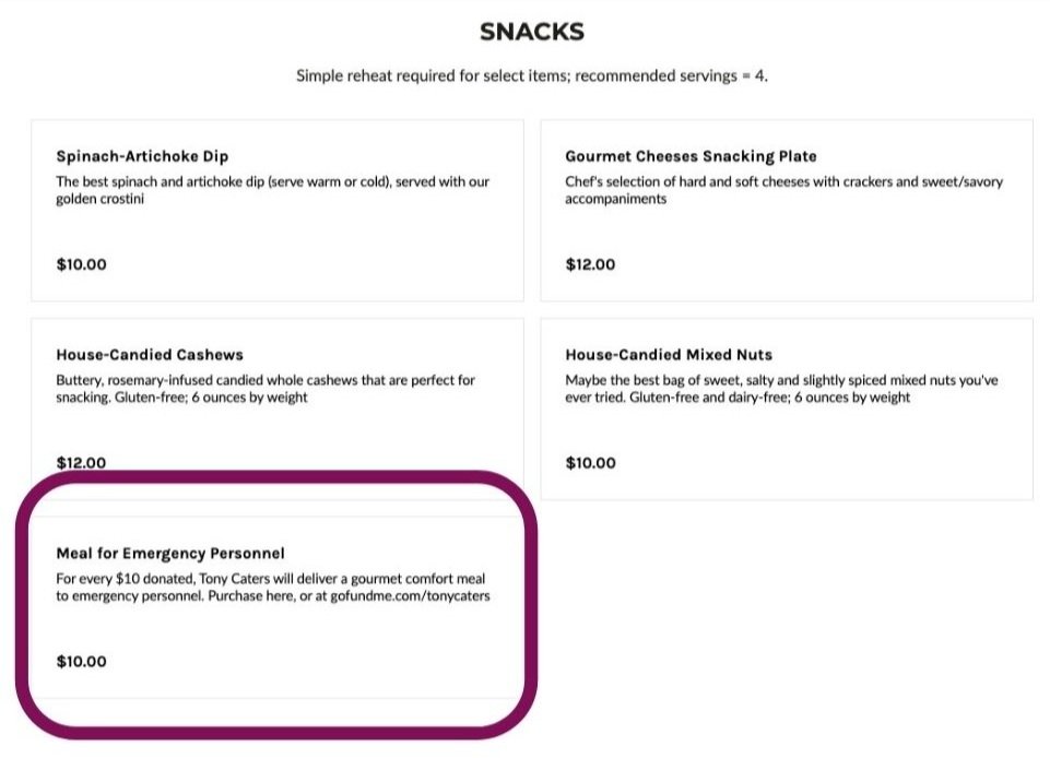
Since “Meal for Emergency Personnel” was an item in each menu section, users thought they had to build a meal for frontline workers.

Navigating back from the search results page lead users to a pop up that signaled the beginning of a new order as well as a “secret menu” with the option to customize items. This left users confused about whether it was a meal delivery service or a restaurant-style food delivery service.

Information Architecture Audit

GLOBAL NAVIGATION
The global navigation is concise, but can afford to be more comprehensive.
Consider providing visual feedback so the user knows what part of the site they are on.
The “Meals Menu” and “Order Now” buttons take the user to the same place. Reconsider the function for each section to provide clear and valuable information for the user.
Menu
Consider incorporating menu categories into global navigation to reduce what’s known as the “dreaded scroll” of stacked menu items.
Consider editing “Meals Menu” to say “Menu” to reduce redundancy.
Hero Image
Although Tony Caters is a traditional catering company at heart, the to-go site should read as a to-go site. Consider replacing the hero image of a table setting with strong images of to-go menu items and/or branded delivery truck/delivery driver.
Existing Sitemap
Click to expand
Recommended Sitemap
Click to expand
Plus/Delta Competitive Analysis

Cafe Primavera
+ clean aesthetic, combines meal delivery and catering service, delivers in one day
Δ smaller selection, not up to date, more expensive, no food images, must email to order
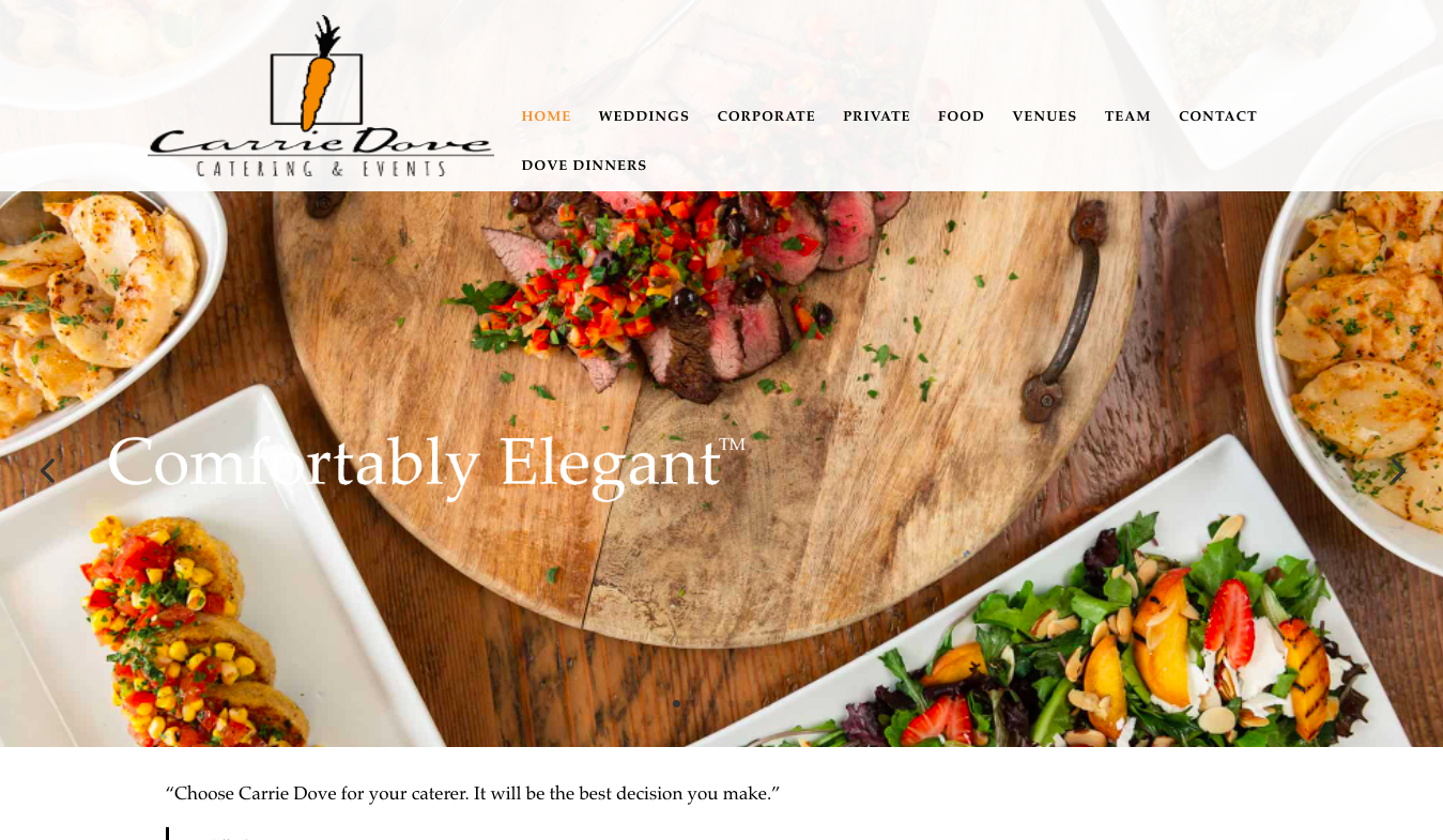
Carrie Dove
+ clean homepage, representational food images, easy navigation, up to date information
Δ strong font combination, tight order window, global navigation doubled in footer

heirloom catering
+ visually clean and sophisticated, minimalist homepage, catering site built into main site
Δ outdated links
User Interviews
Users find value in meal delivery services because
they provide healthy options
there isn’t too much prep or clean up involved
they are able to enjoy a variety of meals they may not make on their own
Personas
Click to expand
Click to expand
Problem Statement
Health-conscious users need a quick and easy way to order meals for the week because they don’t have adequate meal prep time.
How might we…
make the ordering process as simple as possible to make the process of ordering meals faster?
present relevant information to users?
User Flow

Click to expand
Wireframe Sketches
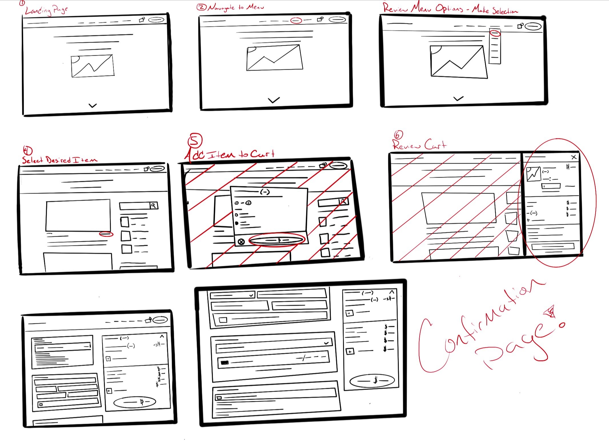
1. Landing page. 2. Navigate to menu. 3. Review menu options. 4. Select item. 5. Add to cart. 6. Review cart. 7. Enter delivery details. 8. Enter payment information
Usability Test I Feedback
Easy to navigate
Clean, professional aesthetic
“For a busy mom, it’s fast and easy.”
Would like to see photos in item description
Shadow on text makes it hard to read
Food image divider was confusing
Click to expand
Usability Test II Feedback
Click to expand
Overall easy to click through, no mistakes
Text is too small
Clean, “classic” design
Great photography
High-Fidelity Prototype

Success Metrics
As the state of California opened up in June of 2021, soon after our team delivered our proposed design solutions, the team at Tony Caters discontinued the meal delivery service that was Tony’s To Go and pivoted back to their original catering service.
If the service had continued and our designs were implemented, I would have worked with Tony to compare sales from before and after the Square site designs were updated. Below are the metrics I would have used to measure the success of our design:
Overall revenue of Tony’s To Go meal delivery sales
Revenue per existing customer
Revenue per new customer
Customer retention among existing customers
Customer retention among new customers
Number of new customers
Overall client satisfaction
Next Steps and Recommendations
Hire a professional food photographer. Stellar photography is crucial for food ecommerce websites. While the photos that Tony shared with us were great, incorporating professional photography will bring Tony’s To Go to the next level and delight both new and existing customers.
Continue to work with the back end of Square to improve functionality. We know it’s been a pain to work with, but we also believe we can make it work!
Add vegetarian/vegan/gluten free to initial product descriptions for quick scanning.
Think about the best placement for the donation section.
Reflection
The limitations of the Square site and its relationship to the main Tony Caters site reinvigorated my interest in learning more about different CMS programs in order to develop design solutions that are as informed as possible. Luckily, our colleague, Cameron Cates, had some experience with Square.

That said, working with Tony Santos of Tony Caters was such a pleasure. I love working with clients who are open to teaching us about their work and learning about how UX can help them get that work done.